Fashion Interaction
LOGO DESIgn
Graphic Design
Social Media Design
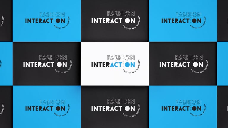
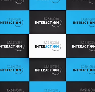
For the branding of Fashion Interaction, I embarked on a creative journey, incorporating cyan as the primary color while conveying a strong fashion connection. The logo design tastefully merged fashion elements, subtly hinting at the brand's essence. Furthermore, the typography choice resembled delicate stitching, adding a touch of craftsmanship and elegance to the overall visual identity.
What I've created:
Corporate Identity
Poster
Social Media Kit
Briefing
The client asked to incorporate the element of sewing into their corporate identity as well as the color cyan. The feeling should be kept modern as their target audience are young fashion students.

Poster Design
Social Media Kit
Corporate Identity
My Design vision
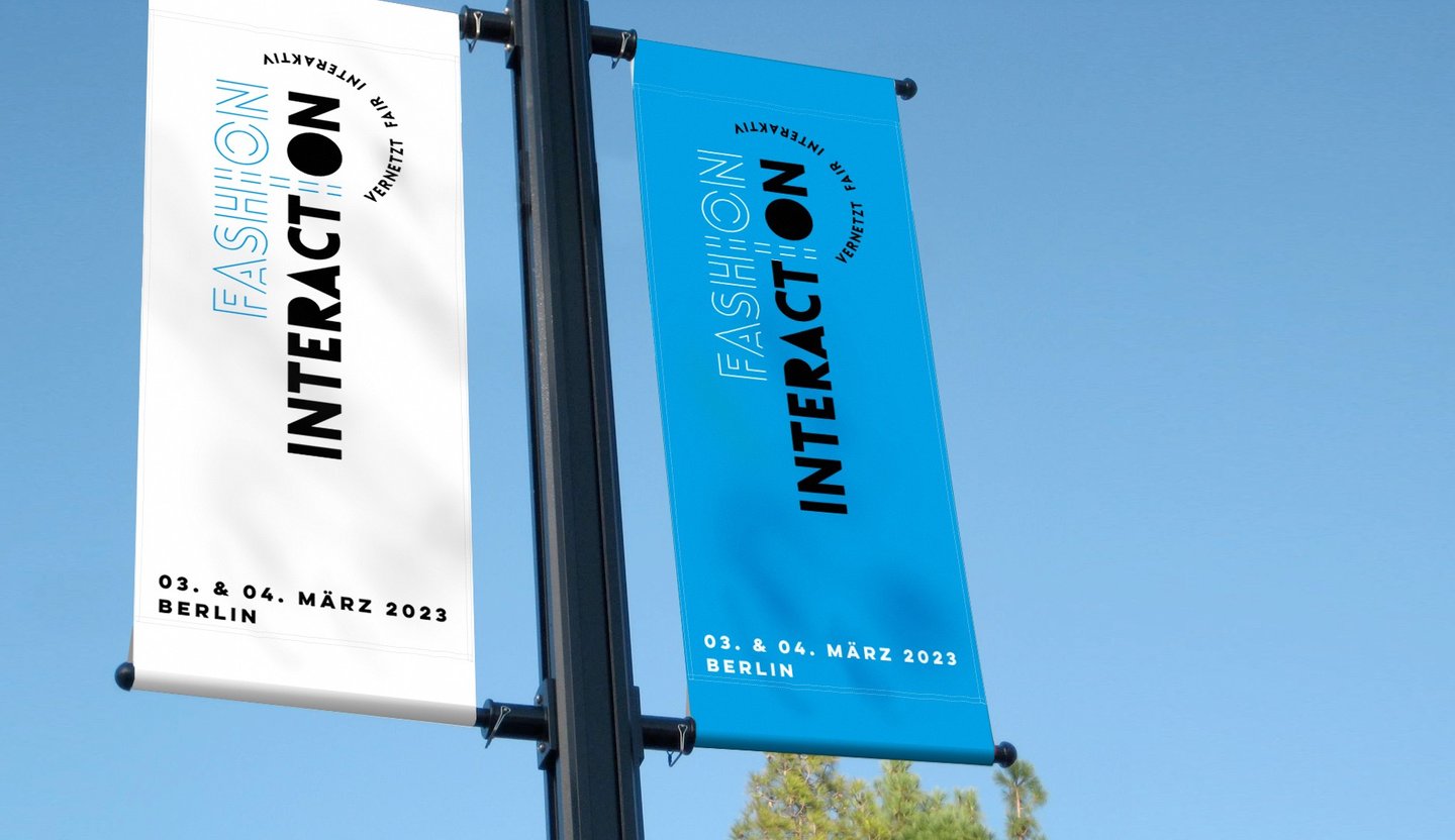
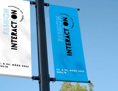
CORPORATE IDENTITY for the design I used the seams of a sewing machine as an element to work as a subtle indicator. The wording Fashion resemble the mesh I created in working with Typography of lines and seams. By using the "I" as an anchor in holding them together. As their slogan is "vernetzt, fair interaktiv" (connected, fair interactive).
My Design vision
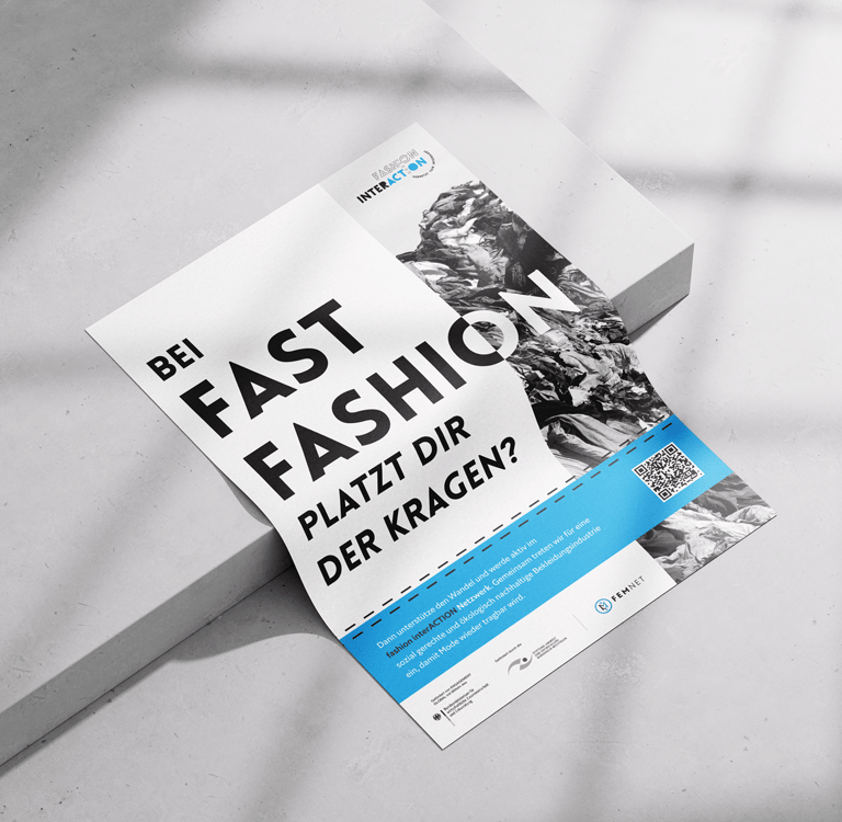
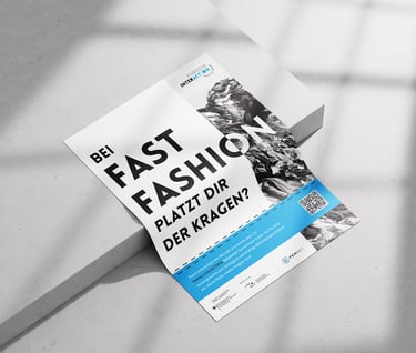
POSTER DESIGN My Goal was to create a Poster which would spark the students curiosity who are interested in fashion. I used an Image of a pile of clothes resulting from fast fashion which is not recognizable at first glance. This was intentional in order to create a thought process on what the event wants to bring closer. That is, Awareness.
Outcome & Benefit
The client was satisfied with the visual outcome. A Modern CI which appeals to their target group as well as gaining their desired awareness which they are promoting.