A concept store by a french family business for children clothing as well as gifts and items for parents.
LOGO DESIgn
Graphic Design
Social Media Design

Chez Pierette
What I've created:
Corporate Identity Logo, Business card
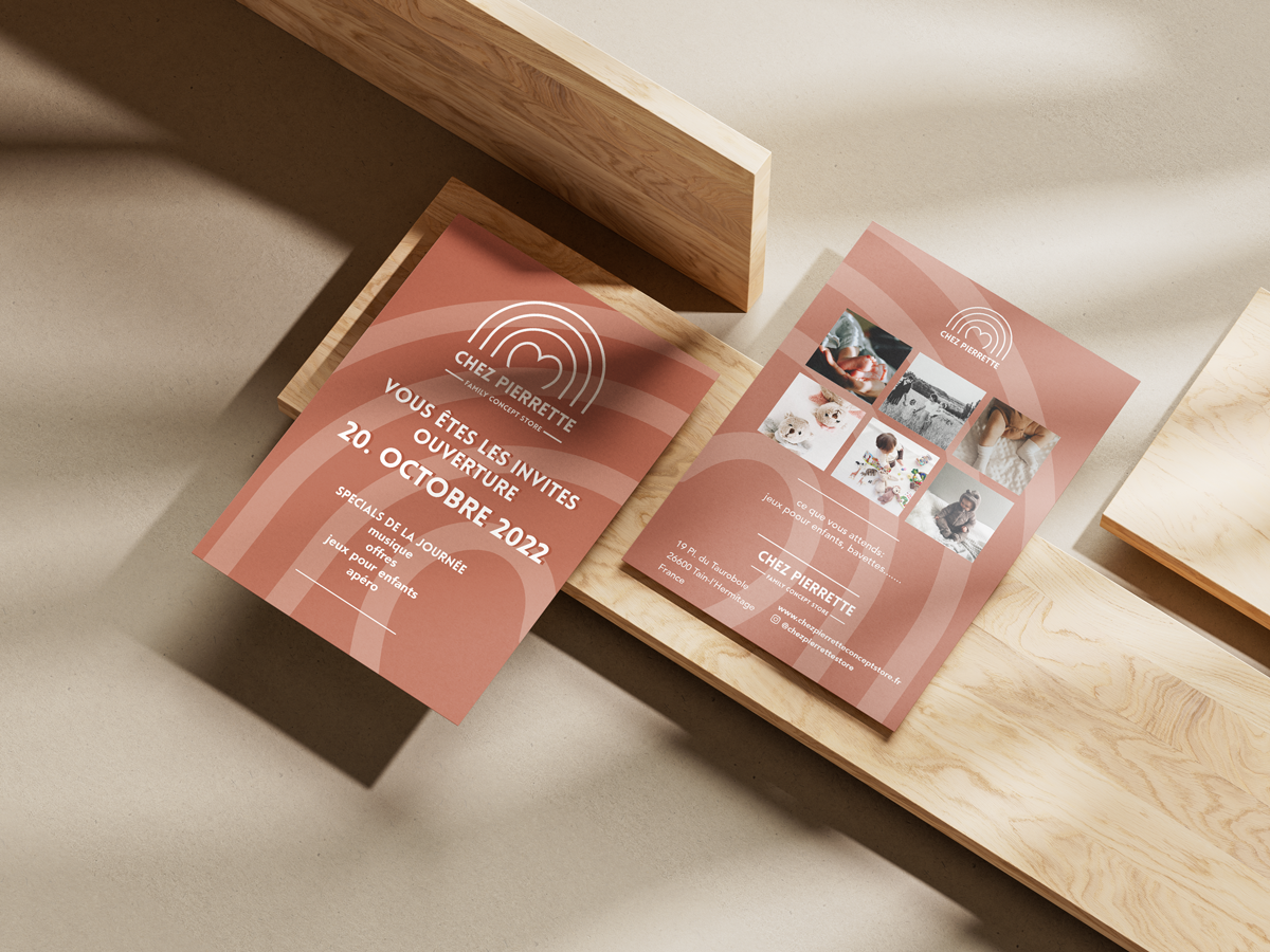
Flyer
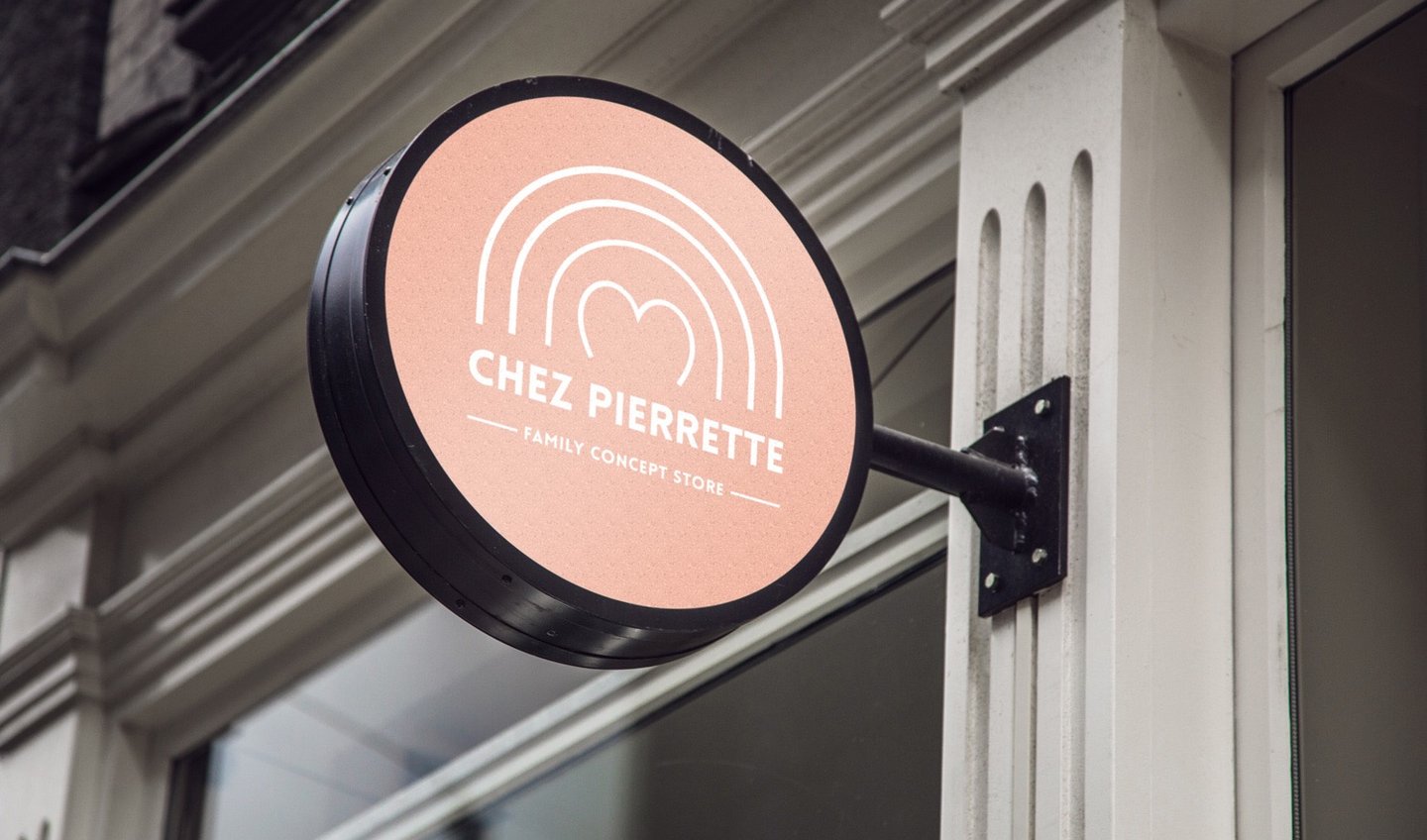
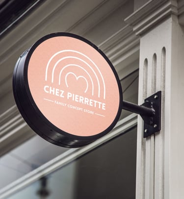
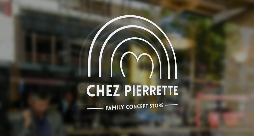
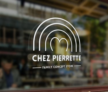
Shop sign (sticker)
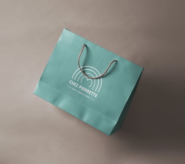
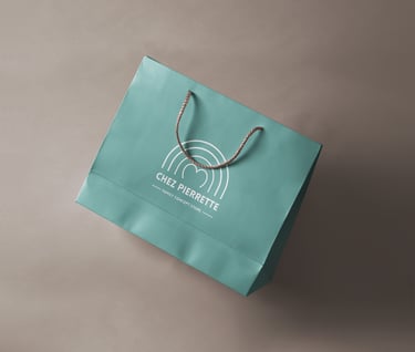
Packaging
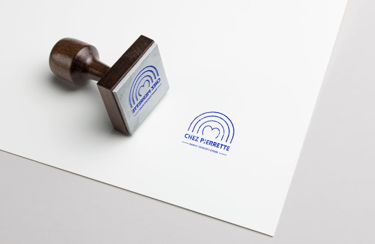
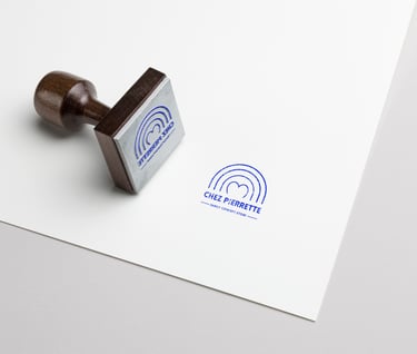
Stamp
BRIEFING
"Pierrette" is the name of the late matriarch of the family and was important to include as it is a family owned business and a hommage to women of this family. The client wanted a modern logo but at the same time for it to reflect the lightness of children.
MY Design Vision
Creating a modern adaptation of a rainbow by replacing it with just lines as well as using a heart in the center which reflects back to the base of a family and that being the nurturing matriarch which is reflected back in this CI. I wanted to create through the bold and fun Typography something childlike and keep it modern. The logo works versatile because it is the background which will set the tone of color and mood, keeping the CI in white.
Outcome & Benefit
The logo embraces their family story and the next generation growing it. They absolutely loved it! It is easy to incorporate it on different advertising mediums, packaging and many other elements in the retail industry, as the background color can change and the CI stands strong, as it should.
We created our logo with Anna for our children's concept store, very professional work, we had several meetings and she immediately understood our ideas and we really got what we wanted.
We recommend her, because her work is Top.
Anne-Sophie & Louisa Skurzak
★★★★★